Liquid Glass and the Quiet Return of Tactility

Apple's Liquid Glass is not a visual refresh. It is the formal end of a thirteen-year flat-design orthodoxy — and the first system-scale admission that humans have bodies.
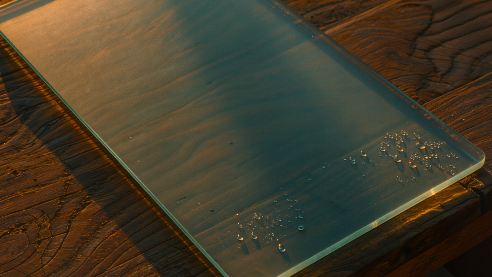
Apple's announcement of Liquid Glass at WWDC 2025, and its full deployment across iOS, iPadOS, and macOS in 2026, was treated by most coverage as a refresh — another in the regular rhythm of design language updates. This was a category error. Liquid Glass is the most consequential design announcement to come out of Cupertino since the introduction of iOS 7 in 2013. It marks, in retrospect, the end of a thirteen-year orthodoxy and the formal rehabilitation of an idea that the design profession had agreed was dead.
The orthodoxy was flatness. In June 2013, Jony Ive — newly elevated to head of all Apple design — flattened iOS 7. Out went the green felt of Game Center, the leather binding of Find My Friends, the bookshelf wood of iBooks. In came hairline borders, sans-serif type at thin weights, translucent layers, and the visual vocabulary that came to be called flat design.
The decision was contested at the time and quickly canonized. Within two years, every major operating system and digital product had moved to a variant of it: Google's Material Design, Microsoft's Metro and then Fluent, the entire visual language of the modern web. By 2018, the only digital products that were not flat were the ones that hadn't been redesigned in a decade.
What was easy to miss, in the consensus that formed, was that flatness had a *reason*. Touchscreens, in 2013, were still novel. Users were learning a new gestural vocabulary — tap, swipe, pinch — and the early iOS skeuomorphism had been a deliberate scaffolding to teach users that yes, this *is* a button, that *is* a piece of paper, this *does* turn like a page. Skeuomorphism was the training wheels of the smartphone era. Once users had internalized the gestures, the metaphors became overhead. Flat design was a sensible removal of scaffolding once the scaffolding had done its job.
The mistake was promoting that removal into a permanent aesthetic principle.
For a decade, the design profession treated flatness as moral. Skeuomorphism became, depending on who you asked, naive, kitsch, or visually dishonest. The argument was that digital surfaces should not pretend to be physical, that affordances should be communicated through pure information rather than borrowed metaphor. This was a coherent position. It was also wrong about how human cognition works.
Don Norman, the designer-cognitive-scientist whose 1988 *The Design of Everyday Things* established the modern vocabulary of affordances, has been quiet but consistent on this point for a decade: humans are not primarily processors of abstract information. We are primarily processors of *spatial and physical* information. Our brains are trained, by some millions of years of evolution, to read depth, weight, texture, and reflection automatically and effortlessly. Strip those cues out, and the brain works harder. A flat interface is not, cognitively, a "cleaner" interface. It is a thinner interface that has shifted load from the visual cortex onto working memory.
Anyone who has spent time inside flat-design products has experienced this in low-grade form: the fatigue of a long working session in tools whose visual hierarchy is communicated entirely through subtle differences in font weight and spacing. There is a reason the dominant productivity-tool aesthetic of the late 2010s induced a particular kind of headache.
Liquid Glass is the formal admission, by the company that started the flat era, that the era has ended.
The aesthetic itself is consistent and considered. Surfaces have weight again — not the heavy-handed weight of 2010 skeuomorphism, but the lighter, more honest weight of glass and refraction. Buttons sit on the surface of an interface, not in it. Light moves through layers. Reflections shift with device tilt. The translucency of windows is no longer a stylistic flourish; it is a structural cue. The eye reads depth without effort. The hand, holding the device, is reminded that something is *there*.
What is most interesting is what Apple has *not* done. Liquid Glass is not a return to the leather and felt of 2010. The objects that once mimicked physical objects — bookshelves, casino felt, address-book leather — have not come back, and they will not. The skeuomorphism of 2010 took specific physical objects as its referents. Liquid Glass takes physical *behavior* as its referent. Light, weight, the way translucent materials sit in space — these are deeper, more general, more universal than any single mimicked object. It is a more sophisticated return to the body.
This matters for two reasons.
The first is technical. Real-time refraction, layered translucency, and physically modeled lighting at sixty or one-twenty frames per second across an entire OS would have been computationally impossible in 2013. The flat era was not only an aesthetic choice; it was the aesthetic the hardware could afford. Apple's silicon improvements have, quietly, made the cognitive case for tactility executable. We are entering a period in which the hardware can carry the body again.
The second reason is cultural, and this is where Liquid Glass dovetails with a wider movement we have written about elsewhere: the human premium, the resurgence of analog typography, the verified-craftsmanship movement. Across categories, the consumer market is in an early-stage corrective reaction against the aesthetics of the high-flatness, high-frictionless 2010s. The reaction is uneven, and it has not yet produced a coherent aesthetic outside of luxury goods. But Liquid Glass is the first system-scale, mass-market expression of it.
Touchscreen interfaces have always had an unsolved problem: they remove the haptic feedback of physical buttons without replacing it. Vibrate-on-touch — the Taptic Engine, in Apple's vocabulary — is a partial answer. Visual weight is a complementary one. A button that looks like it has substance, and that gives a small visual response when pressed, communicates more to the brain than a flat rectangle that simply changes color. The cognitive load of a tactile interface is lower because more of the work is done by the visual cortex, where it belongs.
We will, over the next several years, watch this aesthetic propagate. Material Design's next major revision will move in this direction. The web will follow within thirty months. By 2030, the flat decade will look, in retrospect, like the flat decade of typography looked from the perspective of the 1990s — a coherent and necessary response to the conditions of its era, but an era now firmly closed.
The phenomenology of digital weight is not a side issue. Interfaces are the medium through which most modern humans interact with most modern systems. When the interface gives back nothing — no weight, no reflection, no friction — the human at the other end has to supply all of it. This is exhausting in a way that we have only recently begun to take seriously.
There is a further, subtler point worth making. Tactility is connected to the human premium in a way that most coverage has missed. Both are reactions to an environment of frictionless, machine-perfect output. The dark factory makes physical perfection cheap, and so visible humanity becomes the luxury. Flat design made digital perfection cheap, and so visible weight, friction, and metaphor become the design value. In each case, the new prize is whatever the dominant production system cannot easily make. In 2026, that is the body and the hand.
Liquid Glass is, very quietly, the end of an exhausting decade. It is also, paired with the broader return-of-tactility we have been observing, the beginning of a digital aesthetic that is willing to remember that humans have bodies. It has been a long time since we could say that.